Our commitment to accessibility: High contrast mode arrives with OpenProject 13.1
Ensuring that every user can effectively use the OpenProject software is a core principle to us. Our community thrives on cooperation, and true cooperation can only take place if everyone has the necessary access requirements. With the release of OpenProject 13.1 end of this year, we will be taking another important step towards accessibility: The high contrast mode is intended to provide important support for visually impaired users.
Making digital collaboration accessible for everyone
Accessibility of digital tools is not just about ticking boxes, but about empowerment and inclusion. Our users and customers depend on OpenProject for seamless project management and team collaboration, and we understand that this means providing a platform that’s usable for people with diverse abilities. That’s why accessibility has long been an important issue for us in the development of OpenProject: We strive to comply to the Web Content Accessibility Guidelines (WCAG) 2.1.
A step forward with Primer design system
Our choice to incorporate the Primer design system by GitHub into OpenProject is a testament to our commitment to accessibility. Primer is crafted with accessibility requirements at its core. So by adapting the Primer design system, we ensure that OpenProject’s interface is intuitive and usable for everyone, further embedding accessibility into the DNA of our platform’s design.
Good to know: Primer will be the design system for every new feature in OpenProject and is gradually being integrated into existing features.
Introducing the high contrast mode in OpenProject 13.1
The possibilities for making software more accessible are as varied as people’s impairments. For example, visually impaired people often zoom their browser window up to 500% in order to better see content. This works well with OpenProject for the most part because the mobile view is activated from a certain zoom size.
With OpenProject 13.1, an important feature will help many visually impaired people to better see content even without excessive zooming: The high contrast mode. This is a feature that has been requested by some users and customers and has now been commissioned by the German Federal Ministry of the Interior and Home Affairs (BMI) as part of openDesk, the Sovereign Workplace.
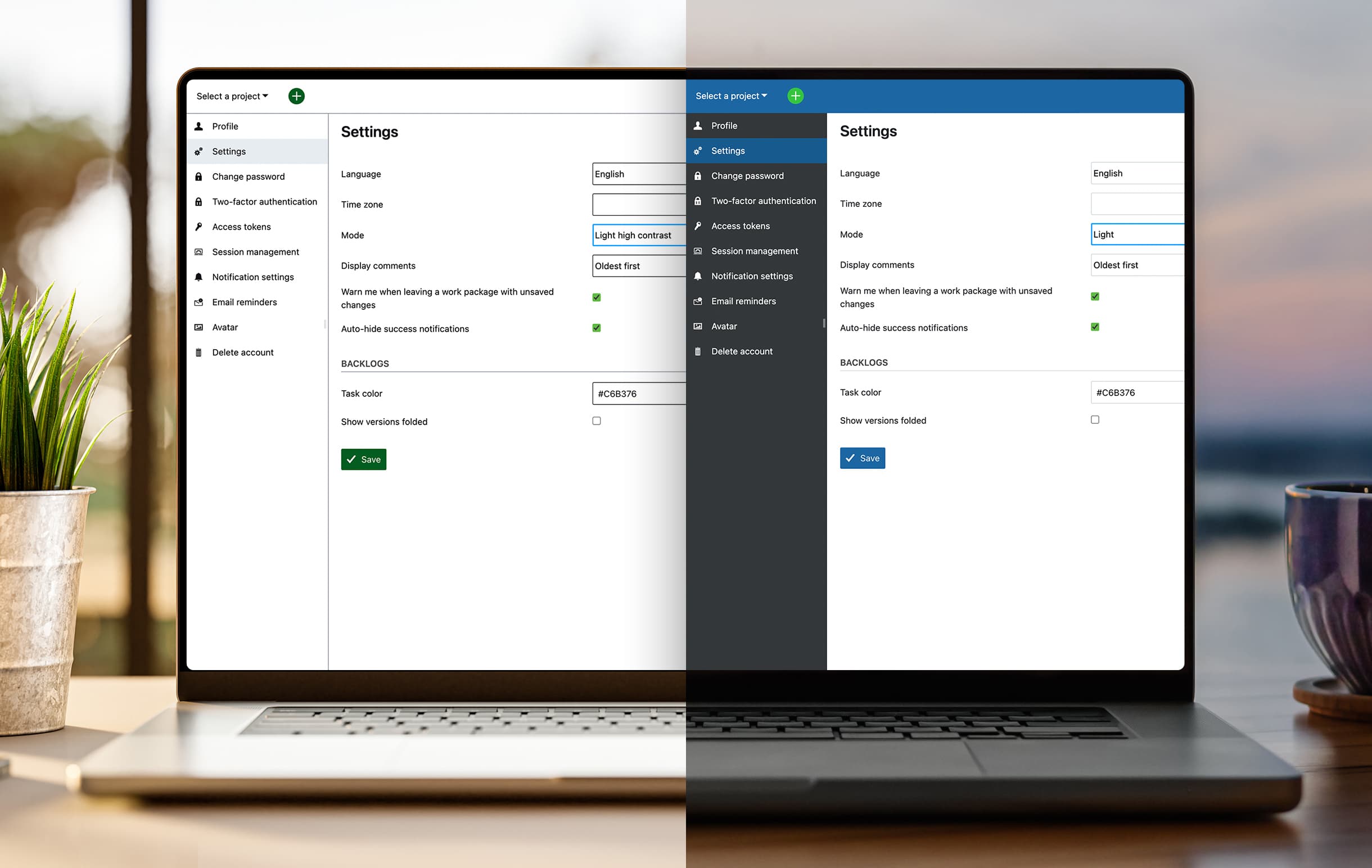
As of OpenProject 13.1, every user will be able to choose between standard mode and high contrast mode. The user interface of others will not change by adjusting this personal mode setting. The high contrast mode means an individual hard overwrite of the existing design: The contrast of every view inside OpenProject will be increased with this mode, and the color theme of the instance is overwritten – for this particular user.
Here’s a preview of the two different mode settings coming with OpenProject 13.1:

Next steps: Accessibility checks for every new development
Looking ahead, we at OpenProject are as dedicated as ever to making our software accessible to everyone. We’re planning to add automatic accessibility checks to make sure every new feature is highly accessible for everyone. We believe that to really help our users, we need to make a tool that works well for anybody who might use it.
In order to pursue our accessibility goals, we welcome suggestions from the Community! So please feel free to add your ideas to our wish list and discuss possible further accessibility enhancements in our forums.


