New fullscreen view for work packages
In the last weeks we have been working on a new concept for the work package detail view (fullscreen). Our goal is to have a new well structured and responsive layout, so that all information and functions are neatly arranged on one page.
We spent a lot of time to improve the whole user experience in order to make OpenProject more intuitive and easier to use. Many UI elements are designed in a much cleaner and new flat way.
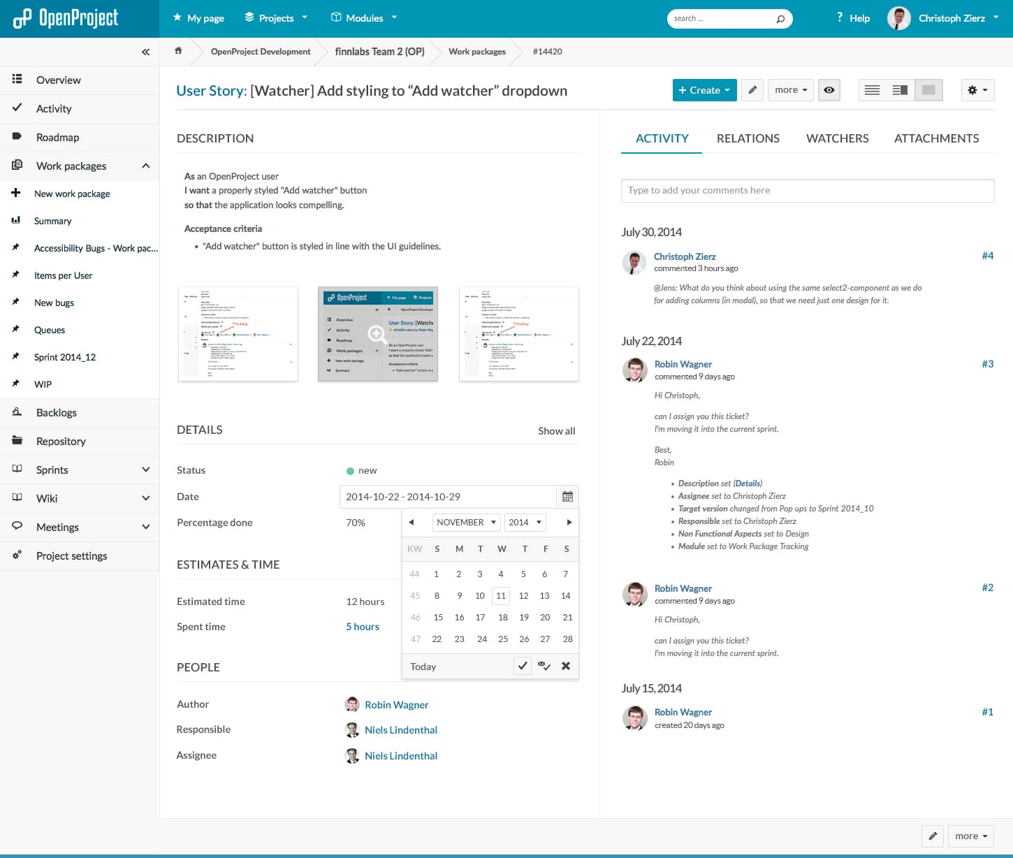
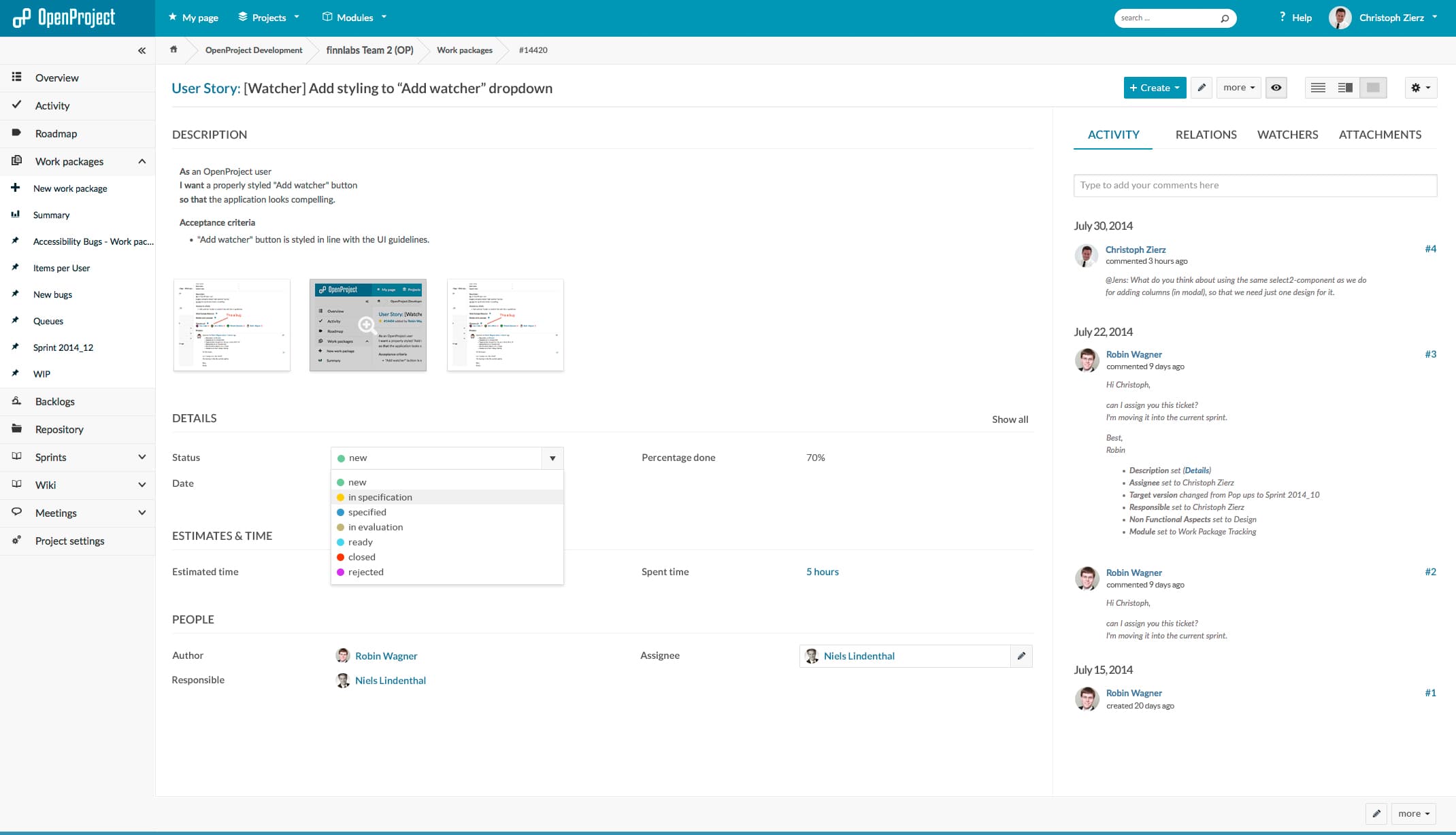
As you can see in the attached drafts, we will provide two different layouts for small and big desktop displays. The responsiveness of OpenProject is a big deal for us and will be part of all future developments.
List of new features:
- new structured layout / more space between contents
- improved toolbar with a view-switcher button
- added watch/unwatch button to the toolbar
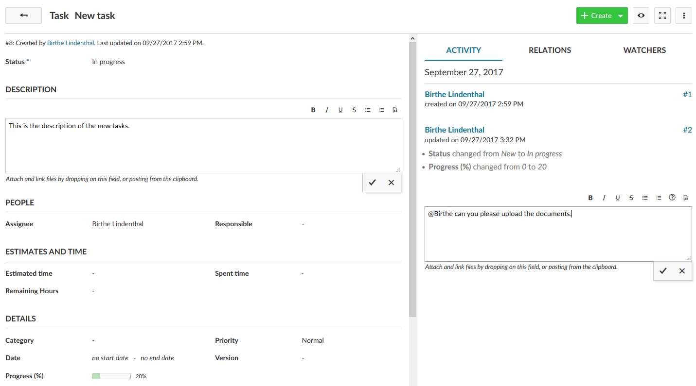
- full accessible inplace-editing
- uploaded images will displayed as clickable thumbnails
- the status will be emphasized by adding colors
- show / hide function for the attributes list
The new work package view (#16364) is scheduled after the completion of the inplace edit for the work package split screen (#13701).
Please let us know what you think of it. Your feedback is much appreciated.


